Appearance Page
Configuring the Manager UI
The settings option 'Appearance' can be used in a custom deployment. You can use it to style your deployment and configure how the pages of the Manager display the assets and attributes in your system. Some of these settings can be changed visually in the user interface, others can be set when selecting the JSON editor. The configuration gets stored in the manager_config file.
In this user guide we will use an example JSON manager_config and give a short description of each section you could include. Note that some pages have a default config that you can overwrite using the manager_config.
By default Superusers (e.g. the 'admin' user of the master realm) will see these styling changes. However, if "manager":{"applyConfigToAdmin":false} is set in the manager_config, most styling changes will not show. This option can be set so that the 'admin' user is not limited by what is set in the config.
View the example manager_config used in the sections on this page.
{
  "realms": {
    "default": {
      "appTitle": "ACME IoT",
      "headers": [
        "map", "assets", "rules", "insights", "language", "users", "roles", "account", "logs", "logout"
      ],
      "styles": ":host > * {--or-app-color2: #F9F9F9; --or-app-color3: #22211f; --or-app-color4: #1b5630; --or-app-color5: #CCCCCC;}",
      "logo": "/images/logo.png",
      "logoMobile": "/images/logo-mobile.png",
      "favicon": "/images/favicon.png",
      "language": "en"
    }
  },
  "pages": {
    "map": {
      "card": {
        "default": {
          "exclude": [
            "notes"
          ]
        },
        "assetTypes": {
          "WeatherAsset": {
            "exclude": [
              "location",
              "notes",
              "model",
              "manufacturer"
            ]
          }
        }
      },
      "clustering": {
        "cluster": true,
        "clusterRadius": 180,
        "clusterMaxZoom": 17
      },
      "filters": [
        {
          "realms": ["manufacturer"],
          "query": { "types": ["SoilSensorAsset"] }
        },
        {
          "label": "CO2 > 100",
          "realms": [
            "smartcity"
          ],
          "query": {
            "types": [
              "EnvironmentSensorAsset"
            ],
            "attributes": {
              "items": [
                {
                  "name": {
                    "predicateType": "number",
                    "value": "ozoneLevel"
                  },
                  "value": {
                    "predicateType": "number",
                    "value": 100,
                    "operator": "GREATER_THAN"
                  }
                }
              ]
            }
          }
        },
        {
          "label": "Irrigation water flow > 10",
          "realms": [
            "manufacturer"
          ],
          "query": {
            "types": [
              "IrrigationAsset"
            ],
            "attributes": {
              "items": [
                {
                  "name": {
                    "predicateType": "number",
                    "value": "flowWater"
                  },
                  "value": {
                    "predicateType": "number",
                    "value": 10,
                    "operator": "GREATER_THAN"
                  }
                }
              ]
            }
          }
        }
      ]
    },
    "rules": {
      "rules": {
        "controls": {
          "allowedLanguages": ["JSON", "FLOW", "GROOVY"],
          "allowedActionTargetTypes": {
            "actions": {
              "email": [
                "CUSTOM", "USER"
              ],
              "push": [
                "ASSET", "USER"
              ]
            }
          }
        },
        "descriptors": {
          "all": {
            "excludeAssets": [
              "TradfriLightAsset",
              "TradfriPlugAsset",
              "ArtnetLightAsset"
            ],
            "assets": {
              "*": {
                "excludeAttributes": [
                  "location"
                ]
              }
            }
          }
        }
      }
    },
    "assets": {
      "tree": {
        "add": {
          "typesParent": {
            "default": {
              "exclude": [
                "TradfriLightAsset",
                "TradfriPlugAsset",
                "ArtnetLightAsset",
                "ArtnetAgent",
                "MacroAgent",
                "ControllerAgent",
                "KNXAgent",
                "ZWAgent",
                "TradfriAgent",
                "TimerAgent",
                "VelbusTcpAgent",
                "VelbusSerialAgent"
              ]
            }
          }
        }
      },
      "viewer": {
        "assetTypes": {
          "WeatherAsset": {
            "viewerStyles": {},
            "panels": [
              {
                "type": "group",
                "title": "underlyingAssets"
              },
              {
                "type": "info",
                "title": "location",
                "properties": {
                  "include": []
                },
                "attributes": {
                  "include": [
                    "location"
                  ],
                  "itemConfig": {
                    "location": {
                      "label": ""
                    }
                  }
                }
              },
              {
                "type": "info",
                "hideOnMobile": true,
                "properties": {
                  "include": []
                },
                "attributes": {
                  "include": [
                    "notes",
                    "manufacturer",
                    "model"
                  ]
                }
              },
              {
                "type": "info",
                "title": "Weather data",
                "attributes": {
                  "exclude": [
                    "location",
                    "radiation",
                    "rainfall",
                    "uVIndex",
                    "currentWeather",
                    "notes",
                    "manufacturer",
                    "model"
                  ]
                },
                "properties": {
                  "include": []
                }
              },
              {
                "type": "info",
                "title": "Extra details",
                "column": 1,
                "properties": {
                  "include": []
                },
                "attributes": {
                  "include": [
                    "rainfall",
                    "uVIndex"
                  ]
                }
              },
              {
                "type": "history",
                "column": 1
              },
              {
                "type": "linkedUsers",
                "column": 1
              }
            ]
          }
        },
        "historyConfig": {
          "table": {
            "attributeNames": {
              "optimiseTarget": {
                "columns": [
                  {
                    "header": "Optimise target",
                    "type": "prop",
                    "path": "$."
                  },
                  {
                    "header": "Timestamp",
                    "type": "timestamp"
                  }
                ]
              }
            }
          }
        }
      }
    }
  }
}
Realm configuration: You can set the branding per realm. In the example below you can see how the page title, headers, colors, and logos are set as default (for any new realm created through the UI), as well as for the 'master' and 'clienta' realms.
{
  "realms": {
    "default": {
      "appTitle": "ACME IoT",
      "headers": [
        "map", "assets", "rules", "insights", "language", "users", "roles", "account", "logs", "logout"
      ],
      "styles": ":host > * {--or-app-color2: #F9F9F9; --or-app-color3: #22211f; --or-app-color4: #1b5630; --or-app-color5: #CCCCCC;}",
      "logo": "/images/logo.png",
      "logoMobile": "/images/logo-mobile.png",
      "favicon": "/images/favicon.png",
      "language": "en"
    },
    "master": {
      "appTitle": "ACME Master",
      "styles": ":host > * {--or-app-color2: #F9F9F9; --or-app-color3: #22211f; --or-app-color4: #275582; --or-app-color5: #CCCCCC;}",
      "logo": "/images/logo.png",
      "logoMobile": "/images/logo-mobile.png",
      "favicon": "/images/logo-favicon.png",
      "language": "en"
    },
    "clienta": {
      "appTitle": "Client A",
      "styles": ":host > * {--or-app-color2: #F9F9F9; --or-app-color3: #22211f; --or-app-color4: #275582; --or-app-color5: #CCCCCC;}",
      "logo": "/images/clienta-logo.png",
      "logoMobile": "/images/clienta-logoMobile.png",
      "favicon": "/images/clienta-favicon.png",
      "language": "de"
    }
  }
}
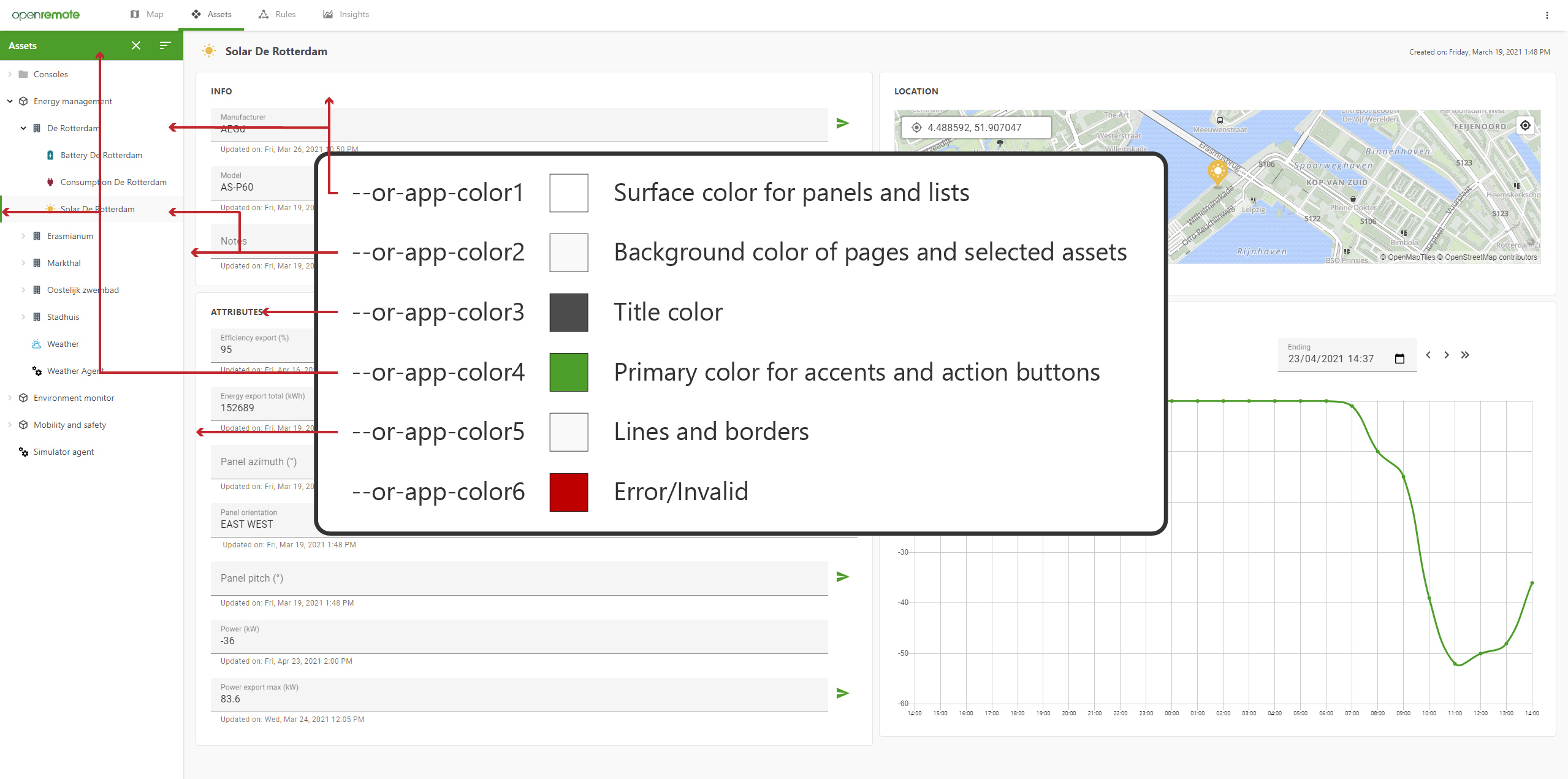
This is what the --or-app-colors look like in the demo deployment:
Assets - tree: Exclude asset types from the 'Add asset' dialog.
{
  "pages": {
    "assets": {
      "tree": {
        "add": {
          "typesParent": {
            "default": {
              "exclude": [
                "TradfriLightAsset",
                "TradfriPlugAsset",
                "ArtnetLightAsset",
                "ArtnetAgent",
                "MacroAgent",
                "ControllerAgent",
                "KNXAgent",
                "ZWAgent",
                "TradfriAgent",
                "TimerAgent",
                "VelbusTcpAgent",
                "VelbusSerialAgent"
              ]
            }
          }
        }
      }
    }
  }
}
Assets - viewer: Configure which panels are shown on the assets page. You can include or exclude attributes to show per panel. These panels can be set for all asset types, or specified per type. This is an overwrite of the default config of the asset-viewer. In historyConfig an example is given on how to specify the columns shown in a table for an attribute that is not a number or boolean; if no config is given, it will automatically create columns.
{
  "pages": {
    "assets": {
      "viewer": {
        "assetTypes": {
          "WeatherAsset": {
            "viewerStyles": {},
            "panels": [
              {
                "type": "group",
                "title": "underlyingAssets"
              },
              {
                "type": "info",
                "title": "location",
                "properties": {
                  "include": []
                },
                "attributes": {
                  "include": [
                    "location"
                  ],
                  "itemConfig": {
                    "location": {
                      "label": ""
                    }
                  }
                }
              },
              {
                "type": "info",
                "hideOnMobile": true,
                "properties": {
                  "include": []
                },
                "attributes": {
                  "include": [
                    "notes",
                    "manufacturer",
                    "model"
                  ]
                }
              },
              {
                "type": "info",
                "title": "Weather data",
                "attributes": {
                  "exclude": [
                    "location",
                    "radiation",
                    "rainfall",
                    "uVIndex",
                    "currentWeather",
                    "notes",
                    "manufacturer",
                    "model"
                  ]
                },
                "properties": {
                  "include": []
                }
              },
              {
                "type": "info",
                "title": "Extra details",
                "column": 1,
                "properties": {
                  "include": []
                },
                "attributes": {
                  "include": [
                    "rainfall",
                    "uVIndex"
                  ]
                }
              },
              {
                "type": "history",
                "column": 1
              },
              {
                "type": "linkedUsers",
                "column": 1
              }
            ]
          }
        },
        "historyConfig": {
          "table": {
            "attributeNames": {
              "optimiseTarget": {
                "columns": [
                  {
                    "header": "Optimise target",
                    "type": "prop",
                    "path": "$."
                  },
                  {
                    "header": "Timestamp",
                    "type": "timestamp"
                  }
                ]
              }
            }
          }
        }
      }
    }
  }
}
Rules - Controls: Set which types of rules are available (for users with the correct permissions), and which actions a rule can perform.
{
  "pages": {
    "rules": {
      "rules": {
        "controls": {
          "allowedLanguages": ["JSON", "FLOW", "GROOVY"],
          "allowedActionTargetTypes": {
            "actions": {
              "email": [
                "CUSTOM", "USER"
              ],
              "push": [
                "ASSET", "USER"
              ]
            }
          }
        }
      }
    }
  }
}
Rules - When-Then: Set which asset types are excluded from the list of asset types that can be selected in the When-Then rule. Additionally you can set per asset (or all '*') which attributes should be excluded from the select list.
{
  "pages": {
    "rules": {
      "rules": {
        "descriptors": {
          "all": {
            "excludeAssets": [
              "TradfriLightAsset",
              "TradfriPlugAsset",
              "ArtnetLightAsset"
            ],
            "assets": {
              "*": {
                "excludeAttributes": [
                  "location"
                ]
              }
            }
          }
        }
      }
    }
  }
}
Map - Card: You can set the attributes to exclude (or include) on the top right card of the map when an asset is selected. This can be done for all asset types (by using default), or per asset type (as shown for WeatherAsset).
{
  "pages": {
    "map": {
      "card": {
        "default": {
          "exclude": [
            "notes"
          ]
        },
        "assetTypes": {
          "WeatherAsset": {
            "exclude": [
              "location",
              "notes",
              "model",
              "manufacturer"
            ]
          }
        }
      }
    }
  }
}
Map - Marker config: This configures how the markers behave. They can either change their colour based on an attribute value (number, boolean, or string), show a label with or without units, and/or show the direction an asset is facing. Note that this part of the config is not yet configured in the manager_config of the manager demo.
{
  "pages": {
    "map": {
      "markers": {
        "ElectricityProducerSolarAsset": {
          "attributeName": "energyExportTotal",
          "showLabel": true,
          "showUnits": true,
          "colours": {
            "type": "range",
            "ranges": [
              {
                "min": 0,
                "colour": "39B54A"
              },
              {
                "min": 50,
                "colour": "F7931E"
              },
              {
                "min": 80,
                "colour": "C1272D"
              }
            ]
          }
        }
      }
    }
  }
}
Map - Clustering config: This configures how clustering behaves. Clustering ensures the map page can render assets smoothly even with 40-50 thousand assets. The clustering option can be disabled, or changed to cluster markers in a smaller radius showing more clusters and changed to start clustering at a certain zoom level. Note that reducing cluster radius or cluster max zoom can have performance impacts. The recommended cluster max zoom level is Maximum realm zoom level - 2.
{
  "pages": {
    "map": {
      "clustering": {
        "cluster": true,
        "clusterRadius": 180,
        "clusterMaxZoom": 17
      }
    }
  }
}
Map - Legend config: This configures what asset types are shown as markers on the map. The legend is enabled by default and can be disabled by setting show to false.
{
  "pages": {
    "map": {
      "legend": {
        "show": true
      }
    }
  }
}
Map - Preset filters:
This configures map preset filters, which add a dropdown on the map page to quickly filter the visible assets by type, attribute values, realm, and more using an AssetQuery. A live matching-asset count badge is shown per filter option. Options without a label will have an auto-derived label based on the type names and attribute values. Selected filters are persisted across page reloads (per user and realm) and reset on each new login session. You can also specify an optional default boolean or an array of realms to limit where the filter applies. Note that unsupported query fields like orderBy, limit, and offset will result in a warning.
{
  "pages": {
    "map": {
      "filters": [
        {
          "realms": ["manufacturer"],
          "query": { "types": ["SoilSensorAsset"] }
        },
        {
          "label": "CO2 > 100",
          "realms": [
            "smartcity"
          ],
          "query": {
            "types": [
              "EnvironmentSensorAsset"
            ],
            "attributes": {
              "items": [
                {
                  "name": {
                    "predicateType": "number",
                    "value": "ozoneLevel"
                  },
                  "value": {
                    "predicateType": "number",
                    "value": 100,
                    "operator": "GREATER_THAN"
                  }
                }
              ]
            }
          }
        },
        {
          "label": "Irrigation water flow > 10",
          "realms": [
            "manufacturer"
          ],
          "query": {
            "types": [
              "IrrigationAsset"
            ],
            "attributes": {
              "items": [
                {
                  "name": {
                    "predicateType": "number",
                    "value": "flowWater"
                  },
                  "value": {
                    "predicateType": "number",
                    "value": 10,
                    "operator": "GREATER_THAN"
                  }
                }
              ]
            }
          }
        }
      ]
    }
  }
}
Map Settings
If you want to adjust the map styling. You can change the map under Map Settings. Here you have the following options:
| Method | Description | When to use? |
|---|---|---|
| Tile server | Configure a tile server (note that this get's priority over the custom map tiles). | If you want to use an external map tile server. |
| Custom Map Tiles | The uploaded map will be used instead of the default (see working on maps for more). | If you happen to have an .mbtiles file and want to view a different part of the world. |
| Style JSON URL | Override the default map settings with a style.json URL (e.g. https://api.example.com/maps/streets/style.json?key=your_key) from a Map/Tile provider that supports MapLibre (see providers). | If you want to configure a different map quickly. |
| Map Layers | After configuring a Style JSON URL you can import it to include the layers allowing you to adjust the map styling. You may optionally configure a Tile server URL (to see more of a map). | If you want to be able to edit the map styling in OpenRemote, but also use an external map. |
| Realm Map Setting | You can set boundaries, zoom levels and center points, as well as add GeoJSON based points, lines and shapes from GeoJSON files. For creating GeoJSON files, you can use e.g. https://geojson.io/. For searching existing GeoJSON map layers, you can use https://overpass-turbo.eu/. | If you want to change focus of the map or add map layers per realm. |
| Custom Deployment | Configure the map through custom deployments. | If you want full control over the configurations on the server (advanced usage). |
OpenRemote picks how to render the map based on the configurations set in the following order: 1) Style JSON URL 2) Import Style Settings & Realm Map Styling 3) Upload Custom .mbtiles 4) Custom Deployment.
Not all Map/Tile providers are fully supported, please check the provider supports MapLibre (see MapLibre providers).
The following tile servers have been tested.
| Provider | Supported | Not Supported |
|---|---|---|
| Maptiler | Most standard maps can be imported | |
| Carto | Basemaps | |
| Mapbox | Tested Classic Mapbox styles using https://api.mapbox.com/styles/v1/mapbox/streets-v12?access_token=pk.ey... | Import settings |
| OpenFreeMap | All maps can be imported |